


Hey guys! Finally, we can move on to the fun stuff with the renovation…
Shop Collective Gen Overalls
Not that all the planning and drawing of ideas isn’t fun, but I have to say there’s nothing better than getting stuck into the detail, and going ‘deep Pinterest’ (kind of like deep sea or deep web – a place you may never come back from). Everything is roaring along with the renovation – because we’re not living in it while we do it, things can happen at a much quicker pace. Meaning…. We’re choosing all the details, fitting and finishings for the house. Yippeee!
Something I was excited about from the very beginning was getting your input and feedback about the ideas that we have for the house… Call it crowdsourced renovating. And there’s no better area than for you guys to have your say than about the colours… Paint colours are completely subjective and come down to your taste, but I’m keen to hear what you guys think. For this reno we’ve teamed up with Haymes Paint for the whole house – they have heritage inspired colours which will be great for the exterior and lots of gorgeous, simple and unique colours for indoors. Yay!


Our Plans
Before we get into the nitty-gritty of you guys giving me your honest opinion about two potential colour palettes, I wanted to give you a bit of a rundown of what we’re planning generally. To start with, we thought about what the overarching goals for the house are – and worked out that it needs to be simple, minimal but also have a bit of personality. So rather than sticking with a palette of just say white and black (which, admiteddly, would look great in the house), we’re choosing to add a few highlight colours into the house by way of cupboards, flat painted pieces of furniture and shelves. This will all be on a base of a light and bright white so won’t be too over the top… I promise! Scroll on for two palettes we’re considering.

Help us choose the colour palette for our renovation!
Option 1: Pink & Mustard
Well well well. If it isn’t my absolute favourite colour palette ever… You’re probably not surprised to see these tones make an appearance in the potential line up. I think these colours would look great as the odd cupboard door, shelf or cabinet here and there around the house. I like the warming, 70’s atmosphere of them paired together. On the other hand, part of me thinks they may date a bit too quickly for my liking, and that they might make a bit too much of a statement… I’d love to know what you think!


Colours
Main colours Minimalist (white), Intimacy (dark grey)
Highlight colours Marengo (mustard), Humas (dusty pink), Cordovan (light pink).
Inspiration
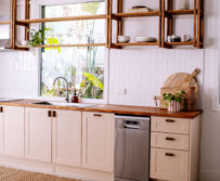
You can see some inspiration below that I like and could potentially see myself living amongst… Once again remember that we’re not painting whole walls these colours, they’ll be incorporated on cupboards, cabinets and shelves, and obviously soft furnishings too!

Option 2: Pink & Khaki
Ok, onto the next option! This time, we’re moving away from the 70’s vibe and going for a bit more of a botanical, pared back feel. We’ve kept in the pink because the Haymes ‘Humas’ pink – which is a cool dusty pink – is such a great tone and one that I really want to incorporate into the house. We’ve replaced the mustard with a light khaki colour, one that I think ups the cool factor a bit and also makes it feel a bit more minimalist. I love this palette, and think it wouldn’t date too fast which is something I’m quite keen on. It would also be a more subtle statement than option one… But do we want to go subtle?!


Colours
Main colours Minimalist (white), Intimacy (dark grey)
Highlight colours Bay Berry (khaki), Humas (dusty pink), Cordovan (light pink).
Inspiration
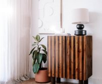
Below is the inspiration for the colour palette, I think it would look particularly great paired with all the plants that will (naturally) be in the house.

Question
Ok guys, I am DYING to know. Which one do you prefer? Are you a 70’s gal or do you prefer something a little more muted… Feel free to let me know in the comments section! You might also be thinking ‘Geneva and Ben are you crazy, those are the worst colours ever?!’ In which case you should totally let me know too. There’s no wrong answers here!
This post is in collaboration with Haymes Paint.
Inspiration images via: Jasmine Dowling, Interior Design, Sight Unseen, NY Times, Apartment Therapy, Pop & Scott, Claire Brody Designs , Rose & Grey


I love colors – it’s my trademark sort of speaking. But just like everyone else I do have favorites. So, I would definitely choose the pink – khaki combination. The first reason is that it’s easier on the eye – think about nature with all that green and pink. The second reason is that khaki (a green hue at the end of the day) and pink are opposites in the color wheel and hence, make a great combination by definition. Mustard, is very trendy right now, but its trending streak won’t last as long. It’s very bright and cozy but as a color it works well is small dosages – think of accents especially on textiles. I wouldn’t ever recommend it as a hue for cupboards, kitchen cabinets and such. But, at the end of the day you should go for whatever feels right for you! Wish you all the best!
Af first I would have said option 1. After reading the above responses, especially the one above this one, I would go with option 2. Velvet’s points are wise. I read them and looked back at both combinations. The khaki is more restful, and the mustard will go out of style. Khaki won’t go out of style.
Yes I totally know what you mean and you make some really excellent points. I think I’m leaning towards something that is a bit easier on the eye!
Option 2 for me! I am just not a fan of mustard at all, so option one didn’t work for me from the start, but then I realized option 2 literally makes your plants part of the colour scheme and there is something just so satisfying about it!
I am definitely for pink and khaki, it’s such a stylish and beautiful combination!
https://www.makeandmes.com/
Thank you honey!
Although I love both options, I think I’d go with #2. The mustard/pink combination would get old too fast for me at least. So unless you’re the type of people to change things up every 2 or 3 years (which to be fair, you might be, but with baby on the way—and congrats on that!—it might be a lot) I think option #2 is more sustainable. The pink/khaki combo is really nice and relaxing for the eyes. Excited to see how it turns out!
I think something we have found is that it’s actually very hard to find a mustard we like…. There just seems to be so many bad ones out there!
Pink and khaki!
I love both options a lot. I kind of like the pin and khaki more by a little bit.
http://sugarcoatedbears.blogspot.com/
Option number one.
Option #2!!! Option #1, though cute, would quickly get old for me, and repainting would be such a hassle for me. Lol
I love the pink and khaki, option #2. I lived through the 70’s in the US where Harvest Gold was the BIG deal. I’m so over gold of any kind. So, it’s purely a personal choice.
Hahaha I guess it’s all about our different experiences isn’t it?
#2 allllll day
I LOVE option #2
Pinks and Khaki! Hands down. Just be careful of the color of the wood pieces in your house. This combo can not withstand any woods that are to the orange side. Ask me how I learned this!!!!
#2
HI !!! I PREFER THE NUMBER 1!!! JELLOW IS BETTER THAN GREEN…
Pink and Khaki!!!
Option #2…but add mustard in with your accent pieces like throw pillows, kitchen towels, art etc
Totally agree!
Eva | http://www.shessobright.com
You read my (and everyone else’s) mind!
#1 – Pink & mustard! I think that khaki will look dated with pink more quickly. However, in using the pink/mustard palette, I’d use the mustard as a pop color, and not use them to the same extreme. I can see walls being a pale peach, but with a contrast wall that is a more saturated peachy pink, and then having a piece of furniture that is mustard. Ya know? Plus, yellow is a very energizing color. Khaki is a fall/winter color, and I just don’t see it perking you up when you need it.
Oh yeah…and after reading some comments, I think khaki green DOESN’T go nicely with the green of plants! Think of the popular plants right now in interiors (monstera, fiddleleaf fig, ferns) – the greens are not warm or desaturated. Khaki is a warm green that shifts towards brown through its desaturation, and might look sickly with more vibrant greens of actual plants.
I guess you’re not into olive trees (which are also popular)! 😉 Khaki varies in shades and it can look great with other green plants just like fields of olive trees next to pine trees, fern bushes, cacti and much more – think of all the Mediterranean basin! If you think about it, nature has all sorts of greens and a lot fewer accents of colors like mustard.That’s why it will always be a safer choice – and I speak as a professional (designer).
The reason I like the mustard is exactly because it isn’t the safer choice. The pink with khaki is definitely a safe bet, but the homes I love the most are the ones that pull in what you love, eve if it isn’t necessarily what’s in style right now. People who have mustard as part of their color scheme generally choose it because they really love it since it’s a pretty bold color.
I totally agree with you – people who have mustard as part of their color scheme is because they truly love it. It so happens though, that mustard is trending big time in home decor right now along with a lot of “rusty” hues. Therefore, it’s best to choose the color that you absolutely love (aside any trends), that will truly reflect your personality and that you won’t get tired to have around in the long run. 🙂
I totally agree that it’s best to choose something you love rather than just something that is trending, and it’s good I’ve got Ben to remind me of that when my mind wanders!
#2 Pink and Khaki for sure. I think because you incorporate so many natural fabrics and textures (wood, straw, rope), along with many gorgeous plants it will go better with those colors. I might be biased though, because I hate orange. Haha!
Eva | http://www.shessobright.com
Hahaha I feel like you either love or hate orange, which is why I guess you need to be careful with it 🙂
Option 2
Pink and khaki! I agree that mustard is having a moment, but is more likely to get old. If you do the pink/khaki, you could still easily bring in gold/mustard pops (pillows, vases, whatnot) that will be easier to change out if you tire of the palette.
I totally agree!
I totally agree love, and I think is what we decided to do!
I think option two, but with gold accents! I reeeaalllyyy love option one but I am worried it will date. But in saying that, you could always just repaint!
I like them both. I would love the first option but use the mustard for fabric items like curtains, throws and pillows. A couple shelves that could repaint easily if you get tired of the mustard later.
I really like the pink and khaki but feel like it’s done a lot so you’ll have to pull out extra creativity to have it look fresh and unique (wait, who am I talking to? Nevermind, girl. You got this). The first collection is nice if yellow is an accent. In the inspirations, it feels like they got “yellow crazy”.
https://www.travellivebreathe.com/
Yes I sooo know what you mean. I can’t wait to share the final look!
Pink and khaki! I do love the mustard inspiration but you have to actually live with the colours on good days and bad! (thinking a screaming new born and no sleep here, mustard, yuck) Plus the pink and Khaki will let you add in other highlights over the next few years, it’s a more versatile palette.
Pink and mustard! I think the mustard can give that pop of color and character that in an old home like yours can make it stand out. I think if the mustard isn’t overused and reserved for accents, then this could be a really great look. I get where the khaki might provide a more neutral pallette over time, but I think you should go with your gut.
Yes I totally agree my love 🙂
Definitely pink and khaki! They look great together, and I don’t think it’ll date as much as the mustard option.
I agree with the first option. You already have grey in your palette with the main grey color (intimacy) and you love having indoor plants, which would add more green in your interior. Choose only a selective amount of furniture pieces that feature the color mustard. It’ll brighten your day/home up without being too much 🙂
Thats a great piece of advice thanks!
#1. I think the brightness of the mustard combination is much more you and speaks to your spirit and outlook on life. I think it’s something you would enjoy waking up to every day and spending time with – and as for it getting dated too quickly, I don’t think you have to worry about that for a quite a while. And by the time you do, I know you’ll be ready to DIY dive into something new, or rethink the color in a new way. Best of luck with the decision and rest of the reno!
Thank you so much Katy, thats a very nice thing for you to say!
Pink and khaki! No need why mustard can’t work itself into a throw pillow or two. Best of both worlds and you’re right- pink and khaki has that perfect, minimalist, cool Cali vibe and who doesn’t love that? It’s so you! Fresh, loveable, easy going. Go for it!! P.S.: Totally obsessed with Humas.
I personally prefer the khaki, but every palette you say you love in your clothing choices is mustard. It seems to be one of your favourite colours!! So while khaki is safer, life is too short to play it safe. Maybe consider using the mustard in places that are easy to change out (ie not expensive) if you go ahead with it. Enjoy the process and can’t wait to see the finished product. I live in Brisbane so can really appreciate your location – it’s amazing.
Gahhhh so many options. Part of me wants to go crazy but the other part of me knows that a more subtle approach my be more enjoyable ona. day to day basis.
I’m not going to be helpful at all – I love them both! I’m a 70s gal deep down but I agree it might date faster than the more muted colours. Whatever you chose it’s going to look amazing though.
PINK & KHAKI! It’s really beautiful and conjures up Morocco. Something about pink walls and cactuses.
Yes totally 🙂
Pink and Khaki for sure! I think it feels more comforting and the khaki gives it an earthy vibe which I think feel every grounding.
Fahmida x
fahmidabx.blogspot.co.uk
Thanks so much my love!
Pink and khaki! <3
Pink and khaki for a relaxed, sophisticated tropical feel x
Both palettes are beautiful! I don’t think the first will get old but for me it is rather for a place that is not your everyday home, like for a hotel or café I´d love these colors! But then again, this is totally subjective. I´d be comfortable in the second option everyday though! 🙂 Oh and I was surprised by the first inspiration pictures because other than I had expected they do look quite suitable for a home!
Yes I know right, it’s surprising. But then again I think I prefer a more muted feel so thats what I’m wavering towards.
pink and khaki for sure:)
I love them I agree with the others that I’d be happier with #2 in the long run. To me, the Pink/Mustard feels a bit awesomely weird and eccentric while the Pink/Khaki feels like a super cool update on the 70s aesthetic. Good luck with your reno!
Yes I totally know what you mean. And thanks so much!
Man this is a tough one they are both such a great combination but if I had to choose I would go for option 2. Pink and Khaki. Dying to see what you choose!!!
#2 would be my choice, it really looks great and less risking on getting bored soon. Mustard could be added by little touches, like cushions or planters. Love your ideas. Regards from Spain
Thanks so much!
Mustard will show its age. Not so sure about all that pink. Pink reminds me of gyn/obstetrical doctors” office.
Khaki okay.
Hahaha thanks Sandra! Never thought of it like that 🙂
Hi! I think palette #1 is sooo amazing! I love that combination <3 Maybe if you use light colours for most things and use pink and mustard in some items you can change in case you get bored like cushions, pottery, some fabrics over the couch… Anyway both palettes are great! Kisses from Argentina!
Thanks so much honey!
I personally LOVE the Pink + Kacki. The Kacki will be great to have since it’s so versatile!
I love the Pink + Khaki! Khaki will be totally flexible when it comes to switching things up down the road!
Yes totally
Definitely no. 2, pink & khaki. It looks more like “your style”! 😊
Thanks my love!
I really like pink and khaki, it brings out a ‘homely’ vibe for this colour combination. You can definitely add the mustard pieces with the pink and khaki colour, with accessories or pillows 🙂
Oh yes totally!
If you go with #1 and don’t want to repaint for years, I’d use the mustard paint sparingly and bring that tone in with my soft furnishings. Option #2 is a bit safer but not as striking. Hard choice!
Thanks so much for the tip!
Awww thats so sweet of you, but colour palette is super important isn’t it?
Ooooo havent seen this but googling now!
Hahaha thats what Ben says!
Totally, you read my mind 🙂
Hahahahahahahahahaha that made me LOL. Cant wait to have to be cleaning poo off the walls.
Thats so interesting, a few people have been saying this!