


Ever since I can remember I’ve loved beautiful handwritten notes.
So you’ll understand my excitement when typography guru and self confessed font fanatic Gemma O’Brien (aka Mrs Eaves), offered to give us a lesson in hand lettering. Gemma rocketed to fame 5 years ago as a uni student with her viral youtube video Write Here, Write Now and has built, in just a few short years, an impressive body of work including hand drawn pieces for Canon (a favorite of mine) and Woolworths as well as a huge number of other creative projects such as developing the masthead for Peppermint Magazine, refreshing the title sequence for children’s tv show Playschool and designing 80th birthday invitations for ex-aussie Prime Minister Bob Hawke (see more of her work here). Today she’s going to show us the basics of hand lettering by making an exquisite hand drawn card – perfect for a friend or lover. Take it away Gemma!
Cast your mind back to primary school cursive practice and the quest to acquire your pen licence. Unless it’s a shopping list or a quick scribble… the hand written word seems to be a dying art these days. Lettering is different to calligraphy – it’s more like “drawing” letters – as opposed to creating them through the strokes of a nib or quill. For this reason, it’s quite accessible to all. You don’t need special tools … just a little practice. Once you’ve mastered your own style you’ll be beautifying the labels on your storage boxes and making hand lettered cards for every occasion.
Today, we are going to create a small card to accompany a bunch of flowers…with hand lettering that will read “Happy Days!”.

How to
Step 1
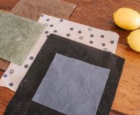
Make a trip to your local art store or newsagency and gather a few supplies. You will need some nice paper with a bit of texture (watercolour paper can be quite good or Mi Tentes has a beautiful selection of cream and pastel papers available in A4 sheets), a 2B pencil, rubber, ruler and a variety of thicknesses of fine black markers… and of course some flowers.


Step 2
Select the size of card you wish to work with. My card is going to be A5 folded in half.

Step 3
Let’s start by drawing some guidelines just to help give our lettering a bit of loose structure. Eventually, after practice, you can draw the lettering freely without guidelines but initially its a good way to maintain consistency and balance to your work.

We are going to draw a baseline (this is the line upon which the letters sit), an x-height(this is the height of the body of the lowercase letters) , a cap height (the height of the capitals) and a stress guide line (this is an angled guide that you can use to give your lettering a certain degree of slant.) If you wish to do a little more background research into the anatomy of letters you can find a great source here. Make sure these guidelines you are drawing are quite faint so you can easily rub them off later.

Step 4
Once you have your guidelines in pencil you can roughly sketch you your letter shapes. Do not be disheartened if they don’t look great immediately. I think for this particular tutorial I wrote out “Happy Days” at least 20 times before I felt happy with it! Let the rhythm of your hand dictate the flow and start by simply drawing the “skeleton” of the lettering. It’s often helpful to look at existing examples of cursive and scripts. They can vary quite dramatically. Sometimes you can luck out and find some old books about scripts in second hand stores otherwise online font foundries have a wealth of reference and inspiration – check out this one.

Step 5
After you are happy with the shape of you pencil skeleton you can start to add width with the strokes. This is where looking at reference comes in handy. Because you are “drawing” in the stroke width (rather than letting pressure or a brush stroke define it) it is helpful to look at examples of calligraphy and fonts to see where the contrasting thick and thins exist. While it’s important to keep the thicknesses relatively consistent across all letters, the nature of hand lettering is that there is always an element of human error… sometimes little mistakes can add character and interest. Once again … practice…practice … practice.

Step 6
Lastly, trace over your sketch with one of the fine black pens and rub away the pencil with an eraser. If you’re working at a small scale like this it’s good to have 0.05 – 0.8 pens on hand. If working at large sizes using a brush pen or brush and ink is more appropriate. Now punch a hole in your card, and tie it to your flowers with a piece of twine…. Happy Days!

Make sure you stay up to date with Gemma’s day to day on her blog, and for those of you living in Australia, Gemma hosts Hand Lettering workshops all around Australia – sign me up!


