
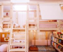


DIY Storage
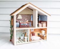
How To Make A Mug House
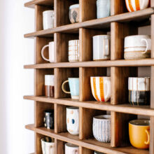
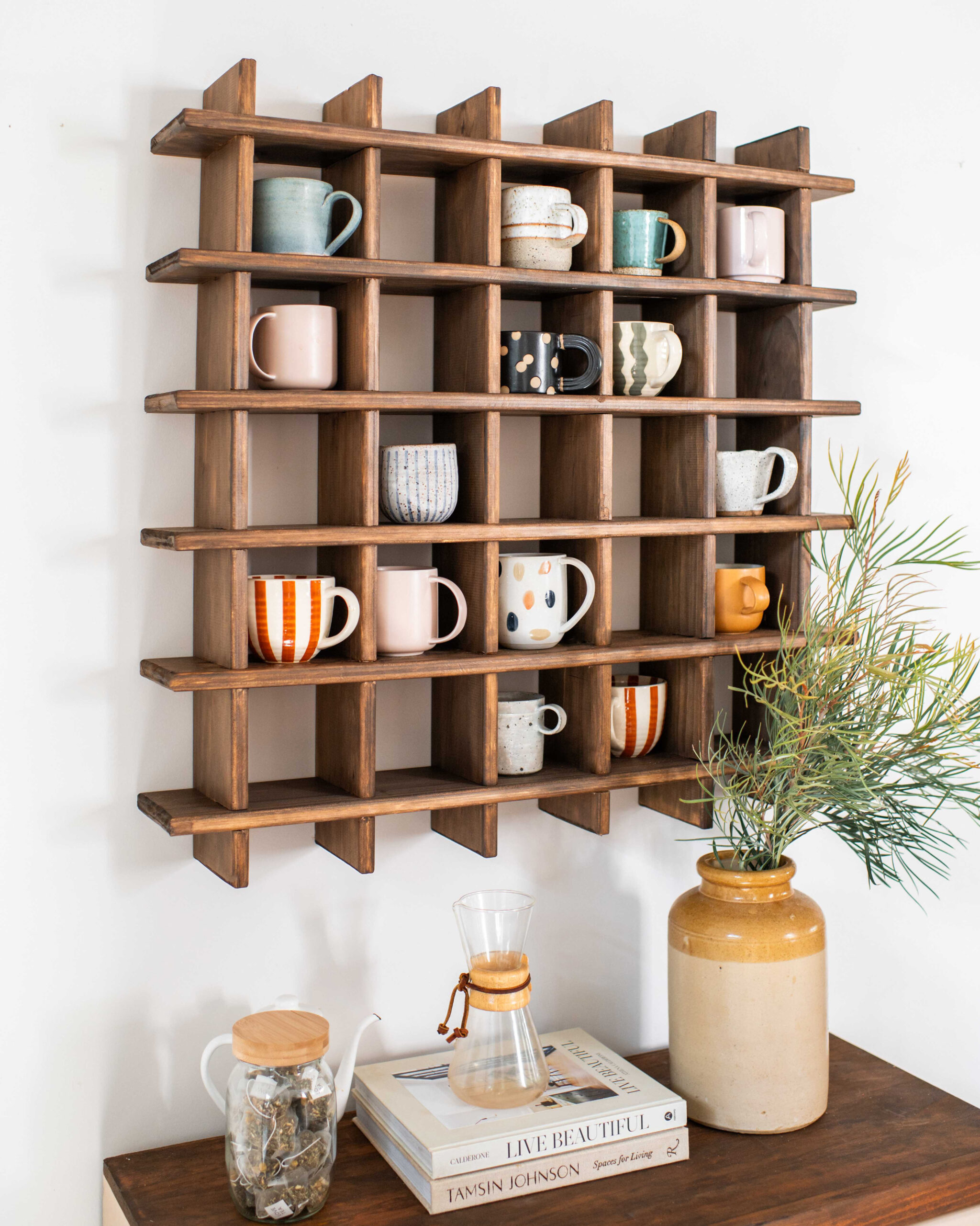
We made a house for our mugs! You are probably all aware of my love...
Read
We made a house for our mugs! You are probably all aware of my love...
Read
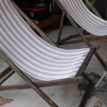
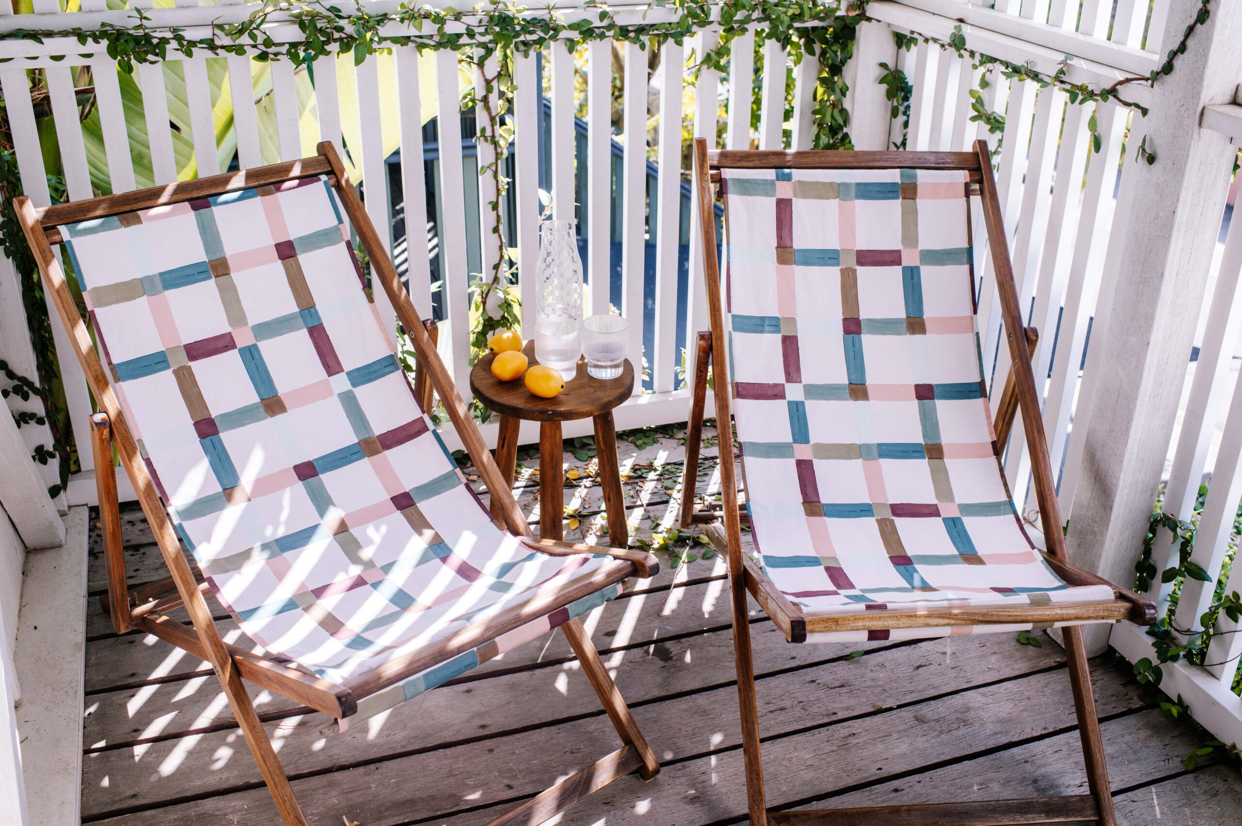
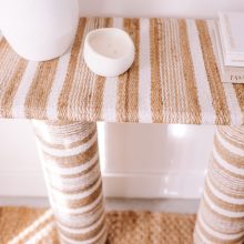
I love the feeling I get when the weather starts warming up and the memory...
Read
I've felt so inspired by textured furniture lately and have been wanting to have a...
Read
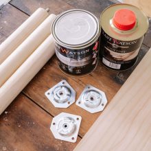
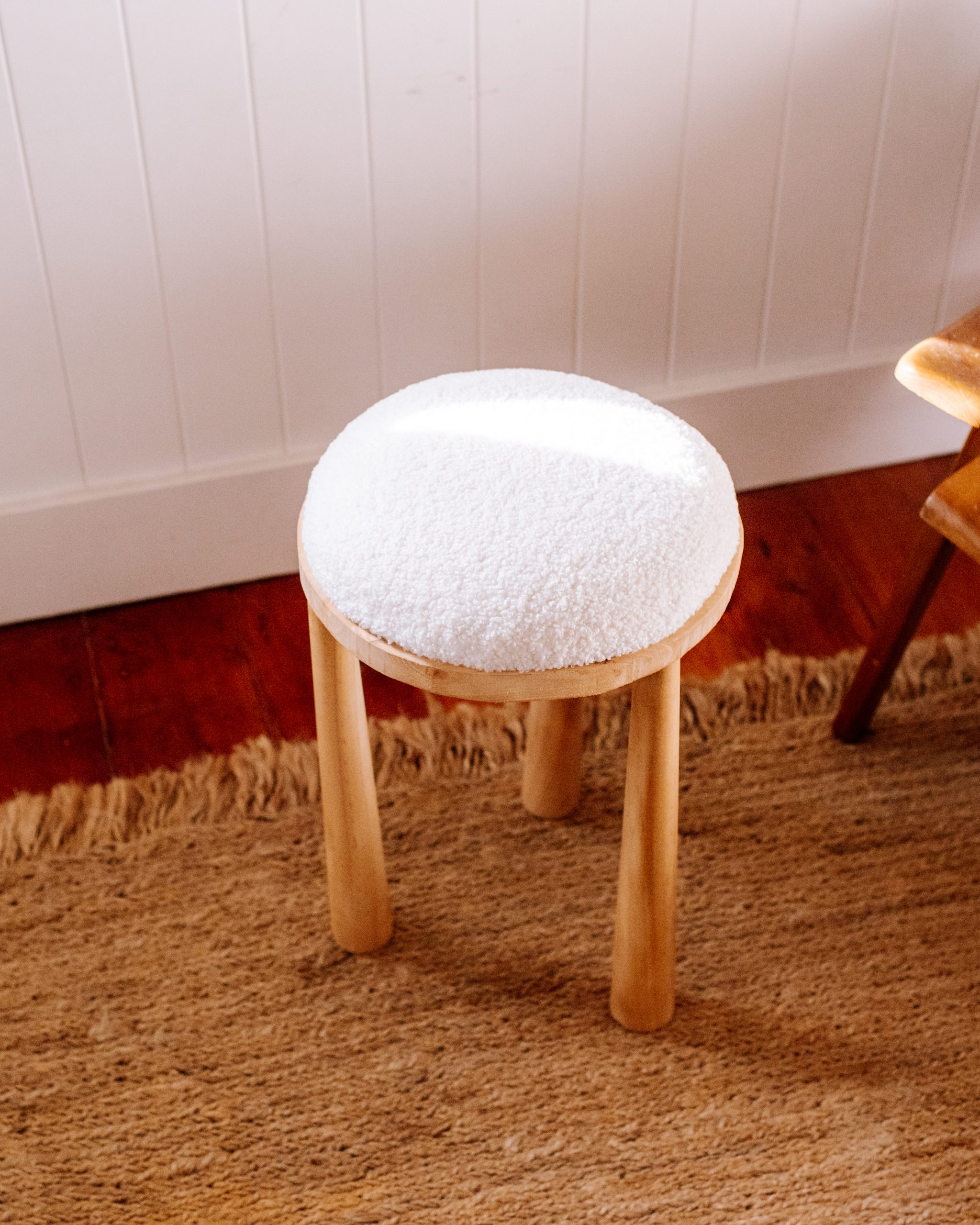
I've been loving the look of chairs and stool made out of wood that have...
Read


Staining wood using a pattern, I know it sounds random but I just had to...
Read


There's nothing more satisfying than a project that doesn't take long to do, and (importantly)...
Read


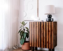
Tall storage cabinets are everywhere at the moment and I've been keeping my eye out...
Read
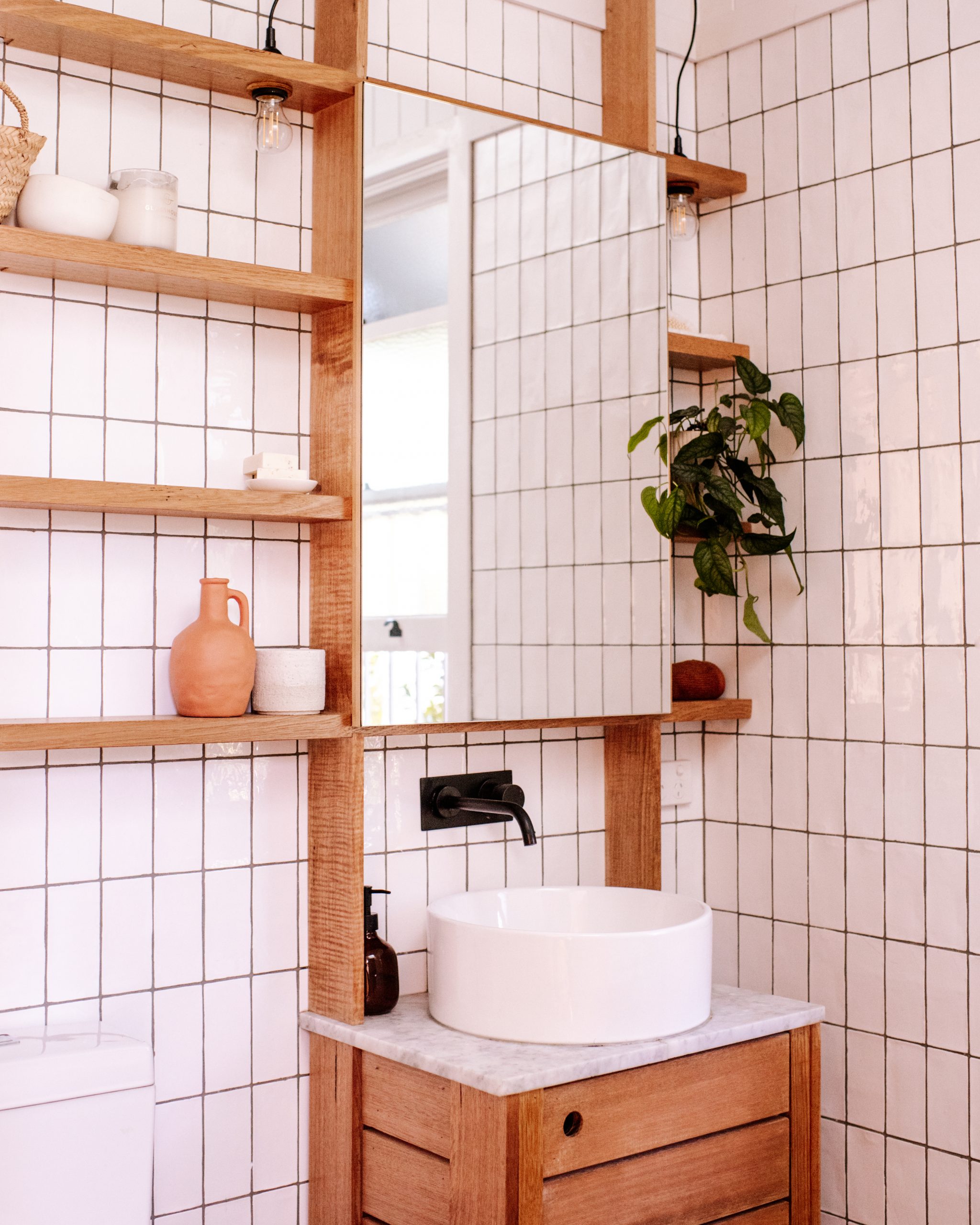
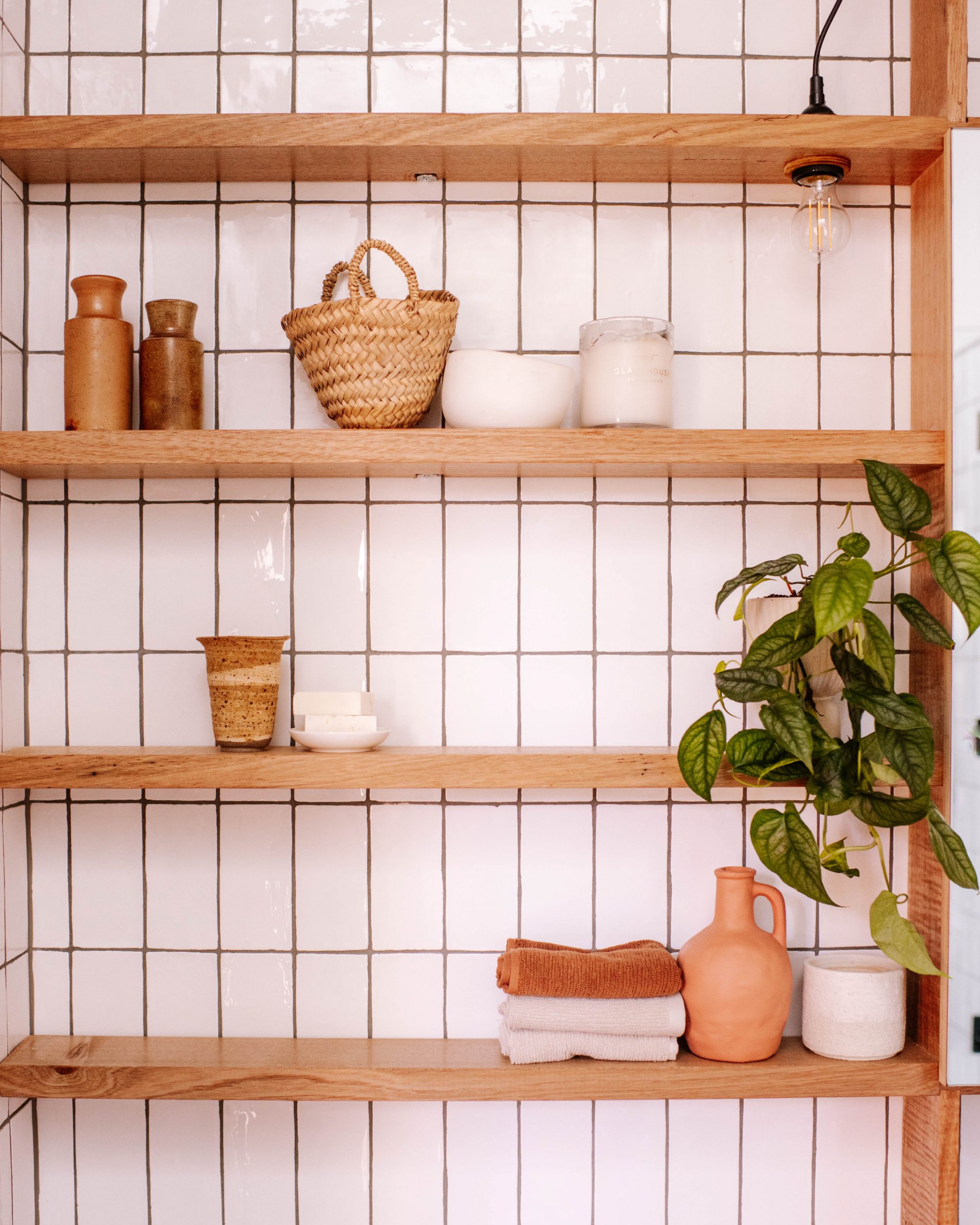
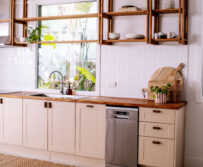
It's been almost 5 years since we renovated our house, so it's about time our...
Read


